According to the all-knowing internets, YA books are targeted to teenagers from 12-18 years old, but publishers sometimes market their books to kids as young as 10 and as old as 25. (And people older/younger than that are certainly reading these books too.) That's cool. I'm all in favor of promoting reading. What I don't like is the cover art.
We've blasted magazines, television, and product advertisements for photoshopping their subjects out of reality. (They're not really listening to us, but at least we're raising awareness.) But, as far as I know, no one is talking about the negative and misleading messages sent by YA book covers. To me, this is even more problematic than a digitally enhanced lipstick advertisement. Here's why:
1) When we read books, we become friends with the characters. We know them. They become people, like you and me, not some distant celebrity doing a commercial. But, according to these book covers, all these people we're reading about look exactly the same: skinny, attractive, and constantly wearing ballgowns. If our friends constantly looks like this, there's probably something wrong with us if we're not. This only heightens the idea that something is wrong with us if our feet are larger than size 6.
2) We've moved away from putting illustrations on the cover of YA books to putting photoshopped photographs on these covers. The purpose of these book covers is the same as the digitally altered lipstick advertisement: to convince you to purchase the product. There's nothing wrong with wanting your advertisement/book cover to be appealing. But I think publishers have an ethical responsibility to look into the messages they are sending with their selected advertisement/book cover. And if their advertisements/book covers are sending false and damaging messages, they should be called out on it.
3) These books are specifically targeted to young people! Hello?! How about a little market management?!? Why don't you just put lipo ads in your books. Does anyone else have a problem with this?
Ahem. Anyway. Looking over YA novels, I've seen that they tend to fall in one of the following categories:
The Ballgown Obsession:


Ballgowns, in and of themselves, are not evil. In fact, they can be fun. A lot of these novels are great because of the escapism element, and I think ballgowns are a signifier of the kind of escapism to be found in the text. I don't want to banish ballgowns from book covers. Far from it. But I think cover artists should consider the fact that real girls don't actually wear them that much. And when they do, they probably won't all look like the above women. Still, this is probably the category that I have the least issue with.
The Ophelia Complex (helpless drowning victims, usually wearing white dresses in water) (This one is really popular):


Obviously the YA market has an odd obsession with precipitation. What they're probably trying to show is that some problems are so difficult they make you feel like you're underwater. There's a particular kind of hypnotizing tension to these covers that give a sense of urgency, and therefore make you want to read the novel to find out if she swims or drowns. The problem, though, is that these covers also objectify the girls' bodies, by virtue of their wet, clingy (and usually white) dresses. The only one that works for me in this batch is "Wish," because she's wearing a swim suit.
The Laying Down Pose (In either the vulnerable, helpless way, or the sultry, come hither way):


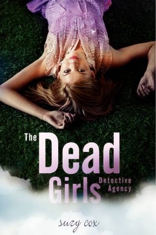
Once again, novels need tension in order to work. Showing those poor young girls laying helplessly on the ground (top row) certainly conveys this emotion. The problem is that these covers also suggest that girls are helpless creatures who just lie down when problems strike, and who need to be rescued, preferably by strange men wearing top hats, as in "The Name of the Star." Their loose clothing also hints at their weakness, their powerlessness. I'd rather see girls who are in control of their life, not subject to the whims of their circumstance. (Agents that act, instead of being acted upon, if you will.) The bottom row is, to me, even more problematic. The look on those girls' faces is very sexual, and not in an empowered way. They appear to be very need-driven. The laying down pose still shows weakness, but in these images that weakness is romanticized and glamorized. These girls solve their problems via their sexuality. Sexuality is a powerful thing, but women are equipped with so much more, and should be aware of other things in their arsenal of awesomeness to pursue their goals. Women don't need to sexually manipulate the world around them to get what they want. What they need is faith, tenacity, creativity, determination, and a willingness to work hard. We should not be sending these other harmful messages to young girls.
The Harlequin Romance Angle:


I seriously considered making a "YA or Harlequin?" poll, showing two different images from each genre and making people guess which was which. But then I got annoyed and moved on.
The Faceless Shot (face is hidden, turned away, or cut out of the image completely in order to place emphasis on the uniformly white, slender body):


This is not unique to women either:

Of course, you could always just go naked (yes, these are the covers to a YA trilogy, not a poster meant for you to hide in your closet):

The See-through Dress Cover (emphasis on skinny, white legs):


The Close-Up-Of-One-Body-Part Shot (These are focused on lips, but there are others):


Another really, really big problem with these covers is that all the models are white. I searched and searched for a non-white person on the cover. My searching yielded two results. Two. I think the girl on the first cover might be Hispanic, but she's still pretty fair. And I'm pretty sure the second book is supposed to take place in a fictional Arab country, which would make the people on the cover Arab, no? Her clothing supports that idea. But then again, the guy is blond. I even looked up the cover art on a few YA books I read that have non-white protagonists, but the cover art either showed a white-washed character, or showed no person at all. I just can't believe there isn't more diversity here.


All these digitally altered and idealized images remind me of the Tina Fey quote:
"Now every girl is expected to have Caucasian blue eyes, full Spanish lips, a classic button nose, hairless Asian skin with a California tan, a Jamaican dance hall ass, long Swedish legs, small Japanese feet, the abs of a lesbian gym owner, the hips of a nine-year-old boy, the arms of Michelle Obama, and doll tits. The person closest to actually achieving this look is Kim Kardashian, who, as we know, was made by Russian scientists to sabotage our athletes. The rest of us are struggling.” (From Bossypants.)
Tina's right. We are giving young girls impossible expectations of their bodies through these images. We should not be angry with our bodies because they are human bodies. We should not judge each others' bodies for not reaching some impossible ideal. We deserve better than that, and we are better than that.

I just really don't like these covers and the messages they send directly to children and teenagers. I think publishers should be more careful with the images they produce, and am calling them out for their negligence. There are better ways to sell books and promote literacy than this.
I'll end on a good note. If you have to put a person on the cover, it can be done tastefully. (Despite my rantings, it is possible.) These are all solid covers:


Some of my favorite book covers, however, have no people on the covers at all. These covers rock:


Other people who have talked about book cover shennanigans:
Seriously, how can you not love someone who mocks stupid book covers by doing this:

And my other favorite:
